Mutti Polpa
Packaging Redesign & Visual Identity
Project Overview
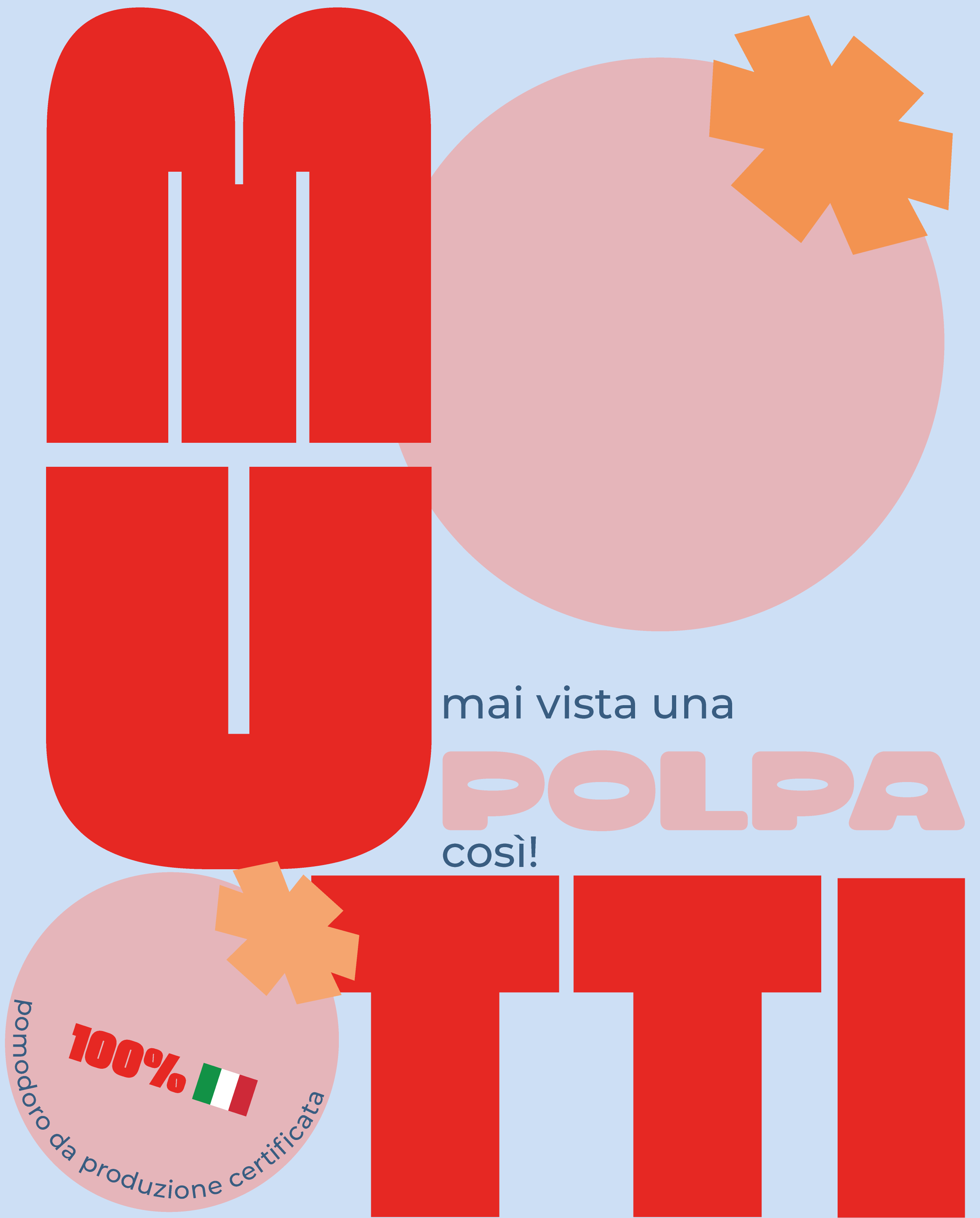
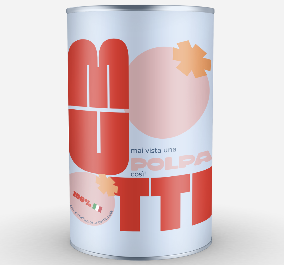
Known since 1899 for its classic Italian heritage and photorealistic labeling, Mutti is a benchmark in tomato conserves. This project rethinks the iconic Mutti Polpa packaging by relying exclusively on typography, turning text into the primary illustrative element to command immediate attention on supermarket shelves.
01. The Challenge: Type as Image
Moving away from traditional photographic imagery of crushed tomatoes and heraldic gold seals, the redesign explores how typographic weight, deconstruction, and scale can communicate flavor and texture without photographic aids. Words and letterforms themselves become the architecture of the can.
02. Deconstructed Lettering: Moco & Montserrat
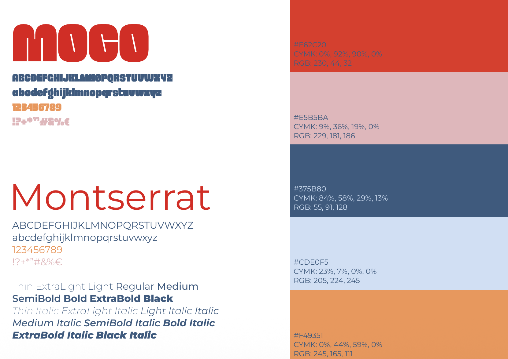
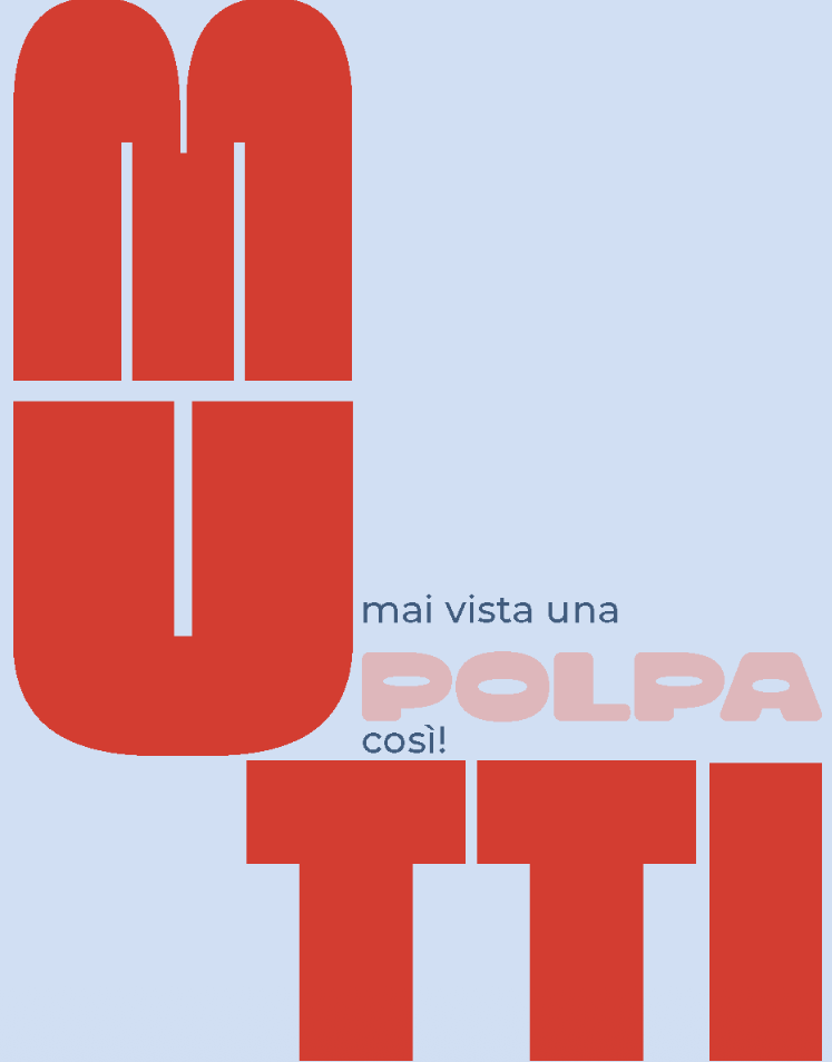
The centerpiece is the bold, chunky 'Moco' display typeface, radically split across the can surface ('MU' on the upper tier, 'TTI' anchoring the base) to introduce vertical tension. This architectural display is balanced with Montserrat across secondary technical data and certification badges to ensure clinical legibility.
03. Chromatic Shift & Pastel Balance
The visual system trades the conventional high-saturation gold and heavy gradients for a fresh Pop-art-inspired color block. Vibrant tomato red is juxtaposed against soft powder blue (#CDE0F5), blush pink (#E5B5BA), and warm botanical apricot accents (#F49351), creating high contrast that feels modern yet appetizing.
04. Asymmetrical Layout & Dieline Development
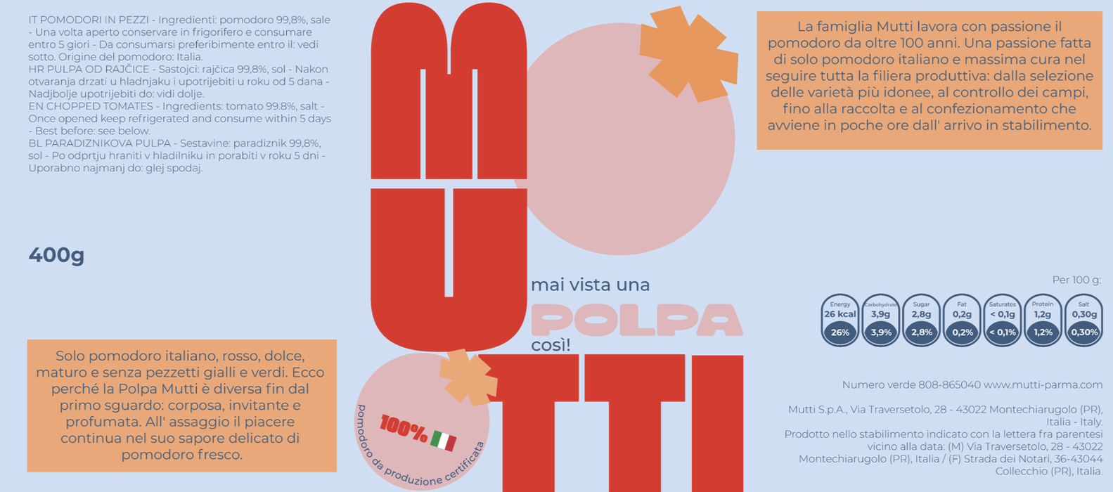
The label breaks the historic center-aligned symmetry in favor of dynamic negative space and asymmetrical text blocks. Complete technical dielines and multipack card wraps were developed, integrating barcode elements, FSC certifications, and nutrition panels into the typographic aesthetic.
05. Shelf Impact & Retail Presence
Simulated in a competitive supermarket aisle environment, the deconstructed packaging stands out as an eye-catching, maximalist statement against monotone competitor cans, demonstrating that typography alone possesses the power to speak clearly in crowded retail spaces.